

Cost per patient
The Money tab shows what the department costs to run for each patient, and how a scenario changes that against the Baseline. It is the last of the report’s six tabs, and it shows only when something in the model has a cost, so a model whose rates are all zero has no Money tab.
The Baseline
Section titled “The Baseline”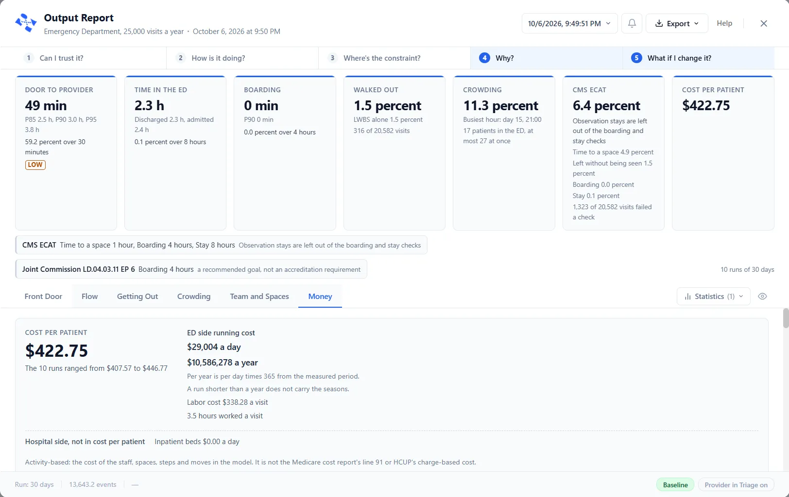
With the Baseline picked, the tab opens on Cost per patient, with the range across the runs: “The 10 runs ranged from $407.57 to $446.77”. Beside it, ED side running cost is given a day and a year, with the notes “Per year is per day times 365 from the measured period.” and “A run shorter than a year does not carry the seasons.” Labor cost and the hours worked follow, each a visit.
The hospital side is kept apart. A line reads Hospital side, not in cost per patient and gives the cost a day of each name on the hospital side, “Inpatient beds $0.00 a day” in the picture. Which names sit there is set under Costing: see Settings for an emergency department model. A last line says what kind of cost this is: “Activity-based: the cost of the staff, spaces, steps and moves in the model. It is not the Medicare cost report’s line 91 or HCUP’s charge-based cost.”
A scenario against the Baseline
Section titled “A scenario against the Baseline”Pick a scenario’s chip at the foot of the report and the tab reads that scenario against the Baseline. Its title is the scenario’s name with “against the Baseline”, and a line under it names what the scenario switched, here “Provider in Triage on”, a care model: see Care models. The headline tiles gain their Baseline lines, as The emergency department report: headline and rules describes.
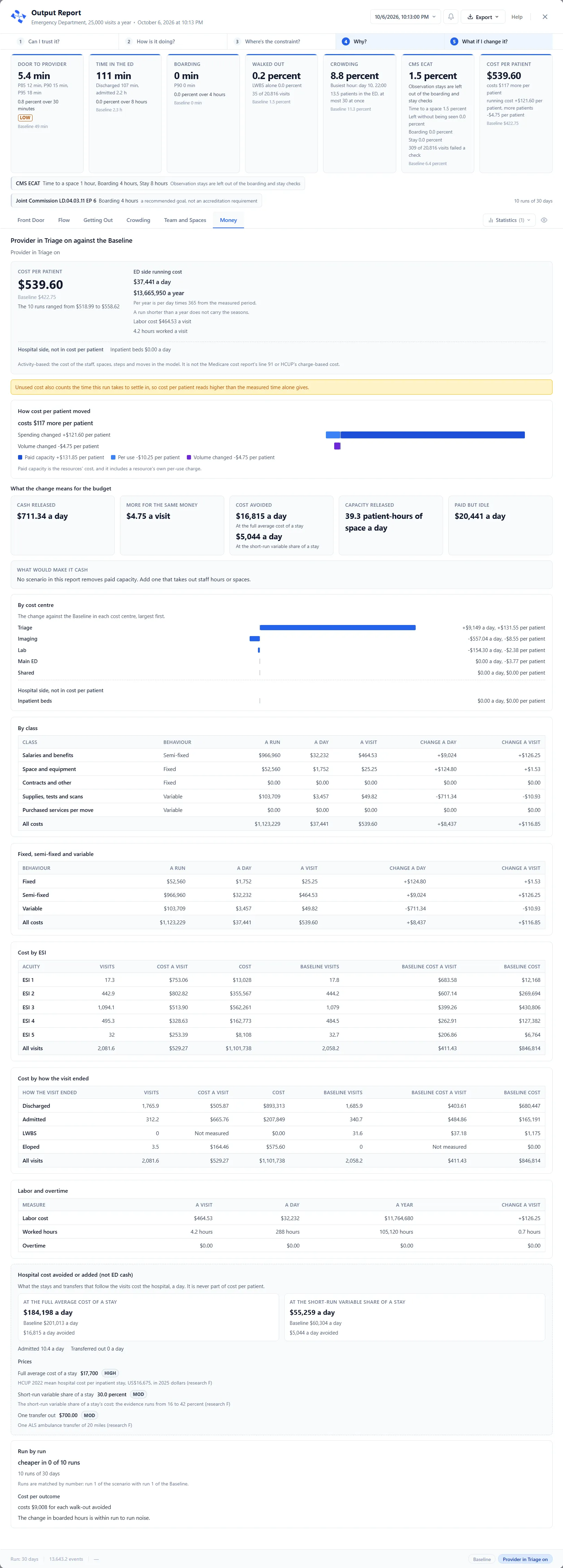
Settle-in time. When the run has one, a note says “Unused cost also counts the time this run takes to settle in, so cost per patient reads higher than the measured time alone gives.”
How cost per patient moved. A sentence such as “costs $117 more per patient” gives the change. Two bars that add up show why: Spending changed, split into Paid capacity and Per use, and Volume changed. “Paid capacity is the resources’ cost, and it includes a resource’s own per-use charge.”
What the change means for the budget. Four finance labels, each drawn even when it is zero: Cash released (a day), More for the same money (a visit), Cost avoided (a day, at the full average cost of a stay and at the short-run variable share of a stay) and Capacity released (patient-hours of space a day). Paid but idle (a day) follows, then What would make it cash, which names a scenario that removes paid capacity or says “No scenario in this report removes paid capacity. Add one that takes out staff hours or spaces.”
Where the money goes. By cost centre shows the change against the Baseline for each name, largest first, with the hospital side apart under Hospital side, not in cost per patient. Tables follow: By class, Fixed, semi-fixed and variable, Cost by ESI, Cost by how the visit ended and Labor and overtime, each with the Baseline’s figures or the change beside the scenario’s. With the Baseline alone they show the cost alone.
The admission line. Hospital cost avoided or added (not ED cash) is a section of its own: “What the stays and transfers that follow the visits cost the hospital, a day. It is never part of cost per patient.” Two cards, At the full average cost of a stay and At the short-run variable share of a stay, give the cost a day, the Baseline’s beside it and the change, such as “$16,815 a day avoided”. Prices names the three prices it uses, each with a HIGH or MOD tag that shows its source on hover.
Run by run. This section sets the scenario against the Baseline one run at a time, for example “cheaper in 0 of 10 runs”. Runs are matched by number, run 1 of the scenario with run 1 of the Baseline. Under Cost per outcome, a sentence says what the change cost for each outcome, such as “costs $9,008 for each walk-out avoided”, or that “The change in boarded hours is within run to run noise.”
Cost against outcome. With the Baseline and at least two scenarios in the report, the tab ends with a chart of this name. It plots each scenario’s change in cost per patient against its change in an outcome, with the Baseline in the middle. The Outcome box picks Walk-outs, Median door to provider or Median boarding, and Show as table lists every point.