

Output Report
Output Report is the results report you get after a run. It opens on the Overview, which leads with the answer: whether you can trust the run, how the process did, and where the constraint is. From there a tab for every part of the model lets you read, filter, and chart the detail.
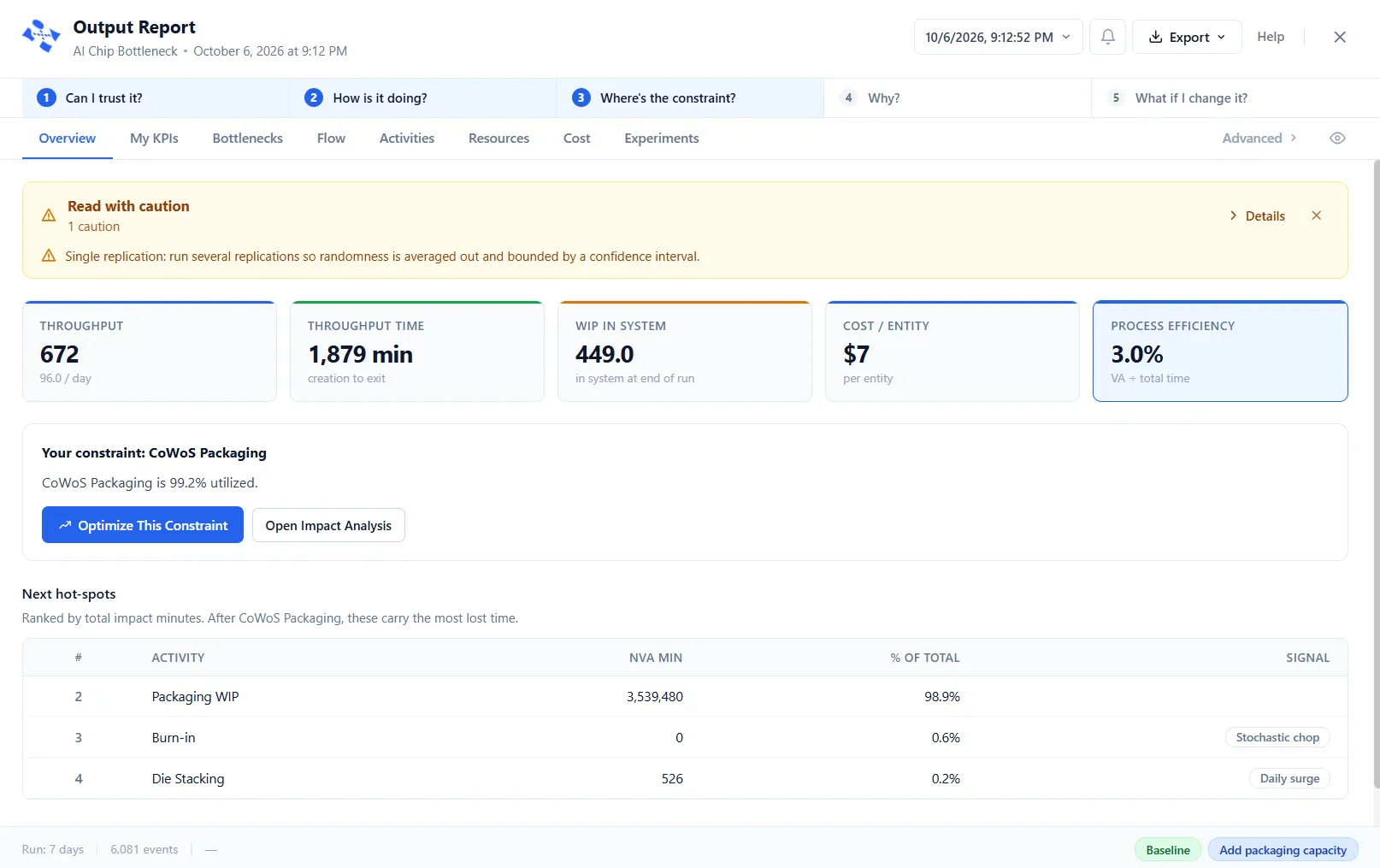
The Overview leads with the answer
Section titled “The Overview leads with the answer”A rail across the top frames the five questions a run answers, in order: Can I trust it? · How is it doing? · Where’s the constraint? · Why? · What if I change it? It highlights the question your current tab answers, so you always know where a number sits in the bigger picture. The rail is a guide, not a set of buttons: it does not navigate. The Overview itself answers the first three.
Can I trust it? A banner gives the run a plain verdict, green, amber or red: Run is trustworthy, Read with caution, or Do not trust this run. It names anything that fell short and counts the findings behind the verdict. Red means no entities completed, which is a fatal error. Amber covers a single replication (its numbers are one roll of the dice rather than an average), a confidence interval wider than ±10%, queue tracking switched off, per-type figures that were estimated, warnings, arrivals during the warm-up excluded, and a run that was stopped early, for example “the run was stopped at 8:11:00 of 24:00:00”. Open Details for the full checklist, or Dismiss the banner for that run. With a warm-up, the checklist reads “Warm-up cleared: 30 minutes. N arrivals occurred during warm-up and are excluded from counts.” and the run length counts from the end of it; with none, it reads “No warm-up configured.” This is a different thing from the yellow SAMPLE DATA banner on a bundled demo, which marks canned figures shown before you have run the model yourself.
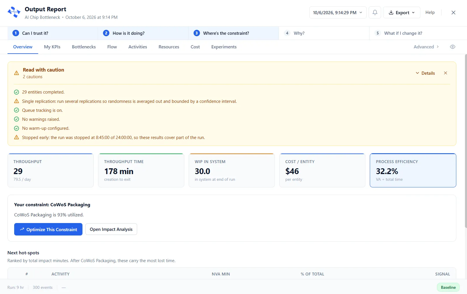
How is it doing? Five key figures sit beneath the banner: Throughput, Throughput Time, WIP In System, Cost / Entity, and Process Efficiency. When entity types differ a lot (the slowest more than three times the fastest, or a rare heavy type), Throughput Time and Cost / Entity split by type and add ”· by type” to the label, rather than blending unlike work into one misleading average. Otherwise each shows one blended figure.
Where’s the constraint? A Your constraint block names the busiest step, says how heavily it is used, and, when the run tracked its queue, describes the pattern behind the wait. Two actions sit beside it: Optimize This Constraint hands the finding to PM Optimizer as a ready-made experiment, and Open Impact Analysis jumps to the ranked detail. Below it, Next hot-spots ranks the steps that carry the most lost time after the constraint.
The tabs
Section titled “The tabs”Past the Overview, the report is a row of tabs. The primary tabs, left to right, are Overview, My KPIs, Bottlenecks, Flow, Activities, Resources, Cost, and Experiments. Advanced, the tab on the right with a chevron, opens a second row for the detailed ledgers: Impact Analysis, Queue Diagnostics, Routes, Gates, Bulk, Process Tables, Variables, and Arrays (each shows only when the model has data for it), then Analysis Rules, where you can see and change the rules the report judges a run by. The report tabs article covers every column, and every table can be filtered, sorted, and searched (see Filtering results).
Because a model runs with variation, the report also shows the spread of the results across replications, with confidence intervals so you know how precise each figure is.
When a lens is on
Section titled “When a lens is on”An industry lens relabels the report to match the model. A model under the Software lens shows the delivery team’s tabs, Forecast, Flow, Team, Quality and Cost, in place of the general ones; see the software delivery report. A model under the Healthcare lens, an Emergency Department, shows Front Door, Flow, Getting Out, Crowding, Team and Spaces and Money under a strip of headline figures, in place of the general tabs. The Fluids, Bulk and Dairy faces are not lenses, so a fluid or bulk model keeps the general tabs wherever they have data. Its tanks and transfer lines are on Bulk, one more tab under Advanced; see The Bulk report.
Going deeper
Section titled “Going deeper”- Bottlenecks ranks every wait-point by where time is spent and gives the top one a single evidence panel, so the constraint and its cause stand out.
- Queue Diagnostics shows, as a heatmap, where and when work piles up.
- Cost rolls up the cost of activities, resources, and entities.
- PM Optimizer goes beyond reading one run: it varies your settings across many runs to find the configuration that works best.
You can export the report to a spreadsheet and copy any table. The date button opens Run History, which lists the runs newest first, marks the newest “(latest)”, and lets you reopen a past run. Each older run has a trash icon, and Delete all runs clears the list; both ask you to confirm.
The header
Section titled “The header”Along the top of the report, from left to right:
- The date button, which opens Run History, described above.
- An amber N Warnings pill, shown only when the run raised warnings. Click it to see them in the Diagnostics panel.
- The bell, which opens the Diagnostics panel on the right of the report, with a count on the bell. The panel lists Errors, Warnings, Display Messages (what your model’s DISPLAY statements wrote) and Entry Denied (the places that refused an entity, each with its reason and a count: choose a row for the detail), and Copy all copies the lot. With nothing to show it says “No diagnostics to show.”
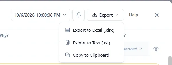
- Export, which opens a menu: Export to Excel (.xlsx), Export to Text (.txt) and Copy to Clipboard.
- Help, which opens this article.
- The X, which closes the report. Esc does too.
When a resource lost units, because an entity left the model while still holding it, a red banner under the header names the resource and says so: “an entity exited the simulation while still holding this resource.” It adds “Check GET/FREE route configuration.” Dismiss it with its X.
LegacyHow this worked in the previous version
Output Report is the advanced simulation output reporting engine for ProcessModel. It serves as the “engine room” for analysis, providing granular data visibility to understand the current state of your system, while simultaneously offering an “AI Layer” to automate insight and predict optimal solutions.
When a simulation is complete, Output Report replaces the traditional output report, offering a ribbon-based interface to filter, customize, and analyze performance metrics.
The Interface
Section titled “The Interface”The Output Report window is organized into a Ribbon Menu at the top, a Report Navigation pane on the left, and the main Data View.
The Ribbon Menu
Section titled “The Ribbon Menu”The ribbon is organized into functional sections to help you manage data visibility:
- Tabs: Toggle the visibility of specific report tabs (e.g., hiding Resources if only focusing on Entities).
- Columns: Filter specific columns within a report to hide information not useful for your immediate analysis.
- Personalize: Change the visual theme of the report.
- Filter: Apply specific logic to narrow down data in the Impact Analysis.
- AI Analysis: Select a focus (e.g., Throughput Time, Cost) and trigger the AI interpretation of your model.
- Custom Report: Tools to create new comparative reports, add images, or text.
- Export: Export data to Excel or print reports.
- Support: Access help documentation.
General Reports
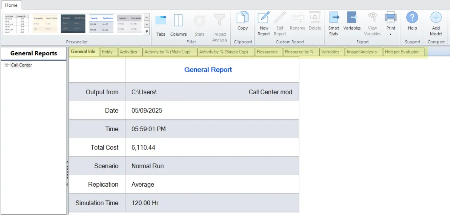
Section titled “General Reports”Output Report automatically generates ten general reports that expose the raw performance of the system. These tabs are located at the top of the Data View.
- General
- Entities
- Activities
- Activity by % (Multi Cap)
- Activity by % (Single Cap)
- Resources
- Resource by %
- Variables
- Impact Analysis
- Hotspot Evaluator
- AI Analysis
Also See:
Custom Reports
Section titled “Custom Reports”Custom Reports allow you to create a comparative view of specific statistics tailored to your presentation needs.
All elements used to create custom reports work the same.
- Select the object to use in the report from the Menu Bar.
- Click on the layout to locate the upper left corner of the stat or graph location.
- Make selections from the dialog to define the object.
The Custom Report includes:
- Text and images
- Stats
- Service Level Agreement
- Filtered stats
- Times Series
- Histogram
- State or Utilization
- Pie graphs
Also See: